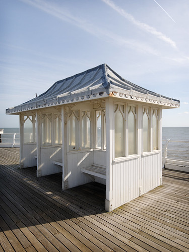
 Classic Nikon D300 territory: soft light, cool palette
On a recent trip to Norfolk, I forgot to take a camera battery charger and so after my trusty Nikon D300 ran down I was forced to resort to my vintage (well, 2005) Nikon D50 as backup.
Now, I’ve had the D300 for over a year and still feel I’m coming to terms with it. It’s somehow a serious camera and it turns out serious‑looking images; in particular, when it comes to colour it’s at its best with cooler, softer, almost pastel‑like scenes – which it renders with a painterly subtlety. When it comes to attempting warmth, it seems to me to to veer off course and crash into a citrus palette. As I've written before, it’s possible to do something about this. Yet somehow the original character of the sensor seems to come through.
The D50, in contrast, seems to produce punchier, vidid (and not‑so‑serious images). What you see below is straight out of the camera converted from RAW to JPEG using DxO Optics Pro and DxO user Andy_F’s default settings (check out the forums to find Andy’s excellent work on better colour accuracy from RAW conversions). And so if I’m not imagining all this, in some ways (whisper it) I might even prefer the look I can get from the earlier camera …
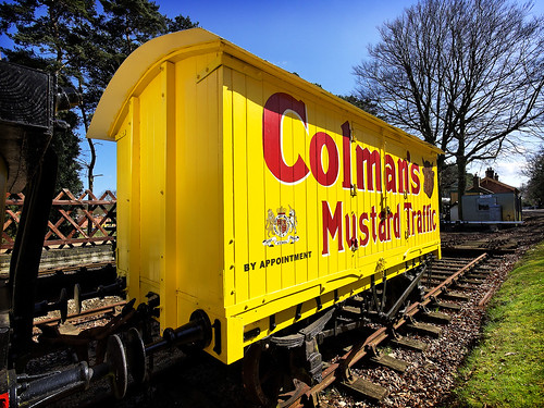 Bam! The Nikon D50 delivering obvious, saturated colours